OVERVIEW
TalkHiring is a mock interviewing tool that helps job seekers improve their interview skills by facilitating virtual practice interviews with industry-relevant questions. When an interview is complete, job seekers can view a recording of their responses, as well as scores on response attributes such as voice volume, number of filler words used, pauses in answers, answer length, and answer relevance.
DESIGN CHALLENGE
The founder was getting feedback from customers that the interview scores were difficult to understand. As a designer for Techstars, I lead a project to improve the TalkHiring interview feedback, enhance visual branding in the interface, and improve the overall mock interview experience.

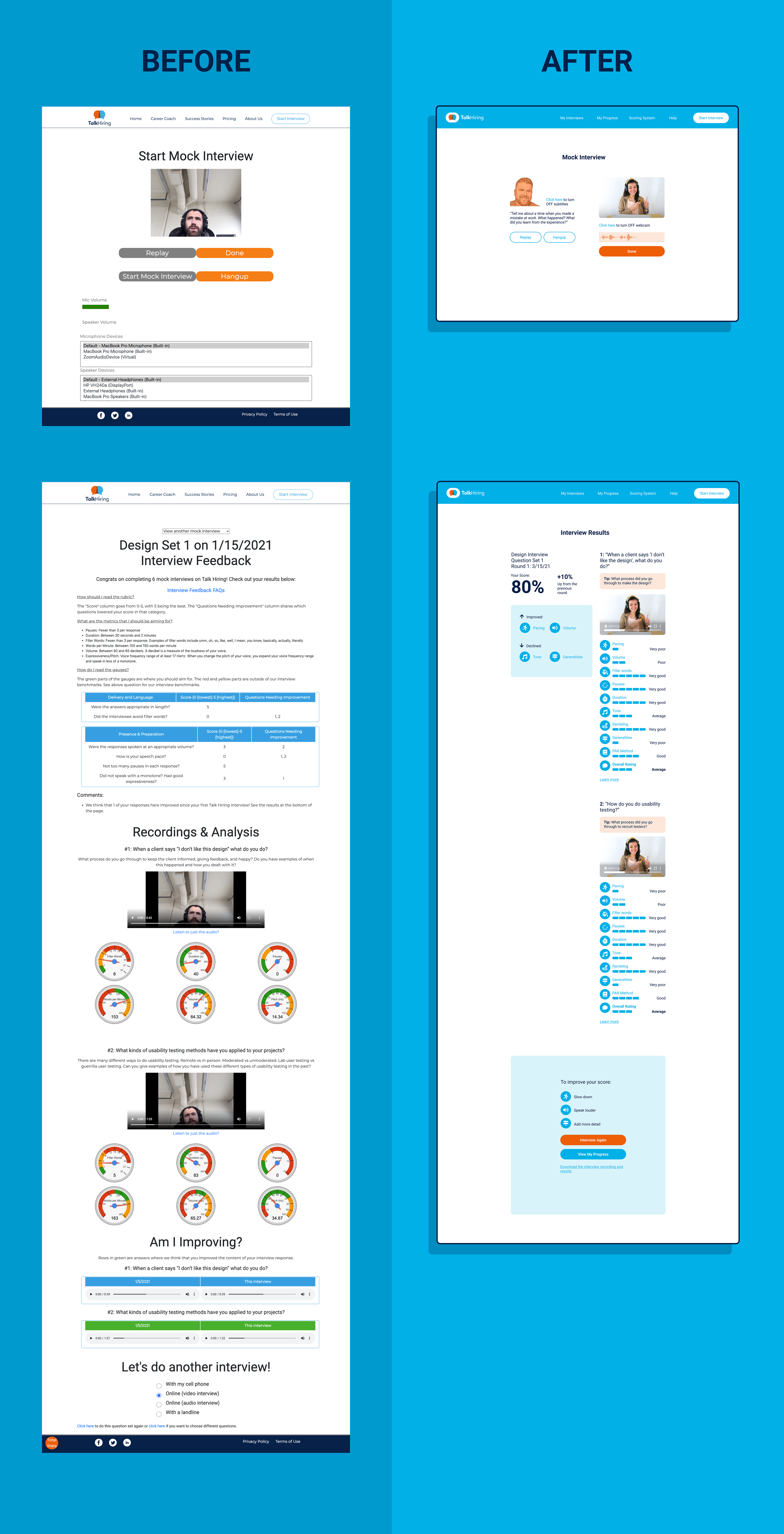
Initial interview feedback page
RESEARCH AND INSIGHTS
After we aligned on research directives in a kickoff session, my design colleague Alexandra Romero and I compiled data from previous TalkHiring research projects (jobs to be done, customer anecdotes), sent out new product surveys to users, did a competitive analysis of similar tools in the market, and also did a UX audit of the mock interview experience.

Miro board with all of the research artifacts and key takeaways
Our sources and methodologies revealed a few helpful insights:
• There were many steps required to start an interview, and also receive feedback
• The mock interview interactions felt a little robotic, and not very ‘human’
• Multiple scoring systems and data visualization styles for the same interview metrics made things confusing
• Users considered certain interview metrics to be more important than others
• The app did not display changes in specific evaluation metrics across interviews
• Other tools on the market showed examples of good and bad interview responses for a sample question, and explained what made them good or bad
SOLUTIONS
Alexandra and I translated the research problems into ‘how might we’ notes, and shared inspiring examples from other similar tools we admired on the web. We used these assets as primers for a collaborative sketching session, and ultimately came up with the final design solutions:
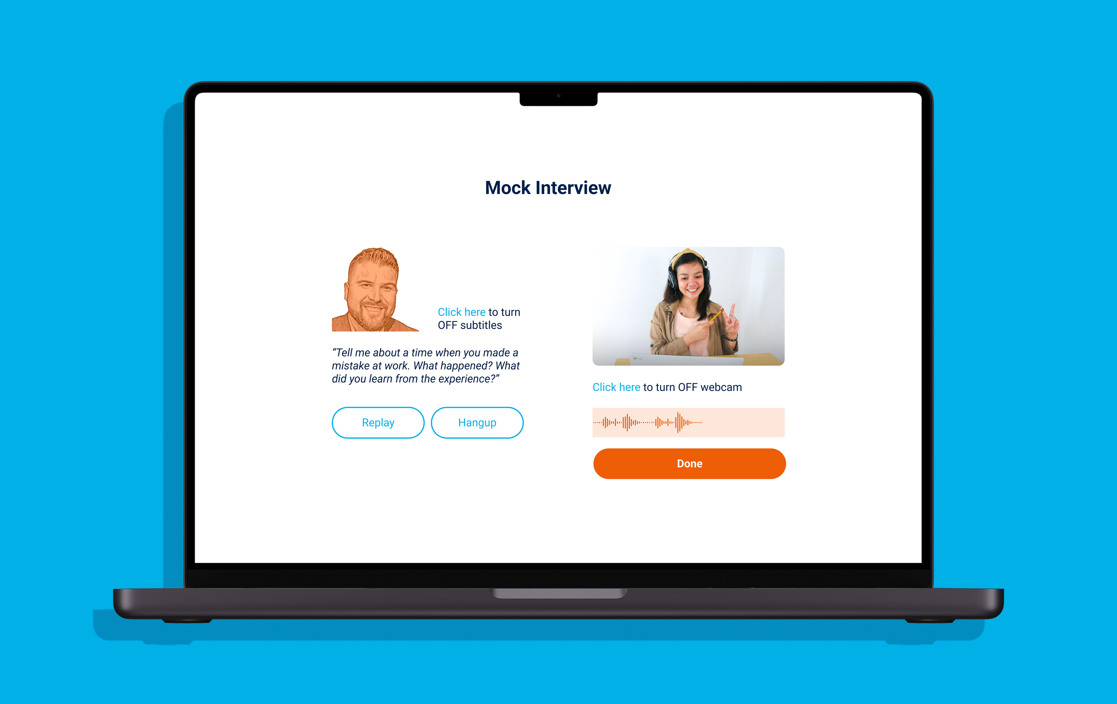
Humanize the interview
Display an interviewer avatar and question text on interview screens to make the practice interviews feel slightly more human
Display an interviewer avatar and question text on interview screens to make the practice interviews feel slightly more human
Simplify the interview feedback
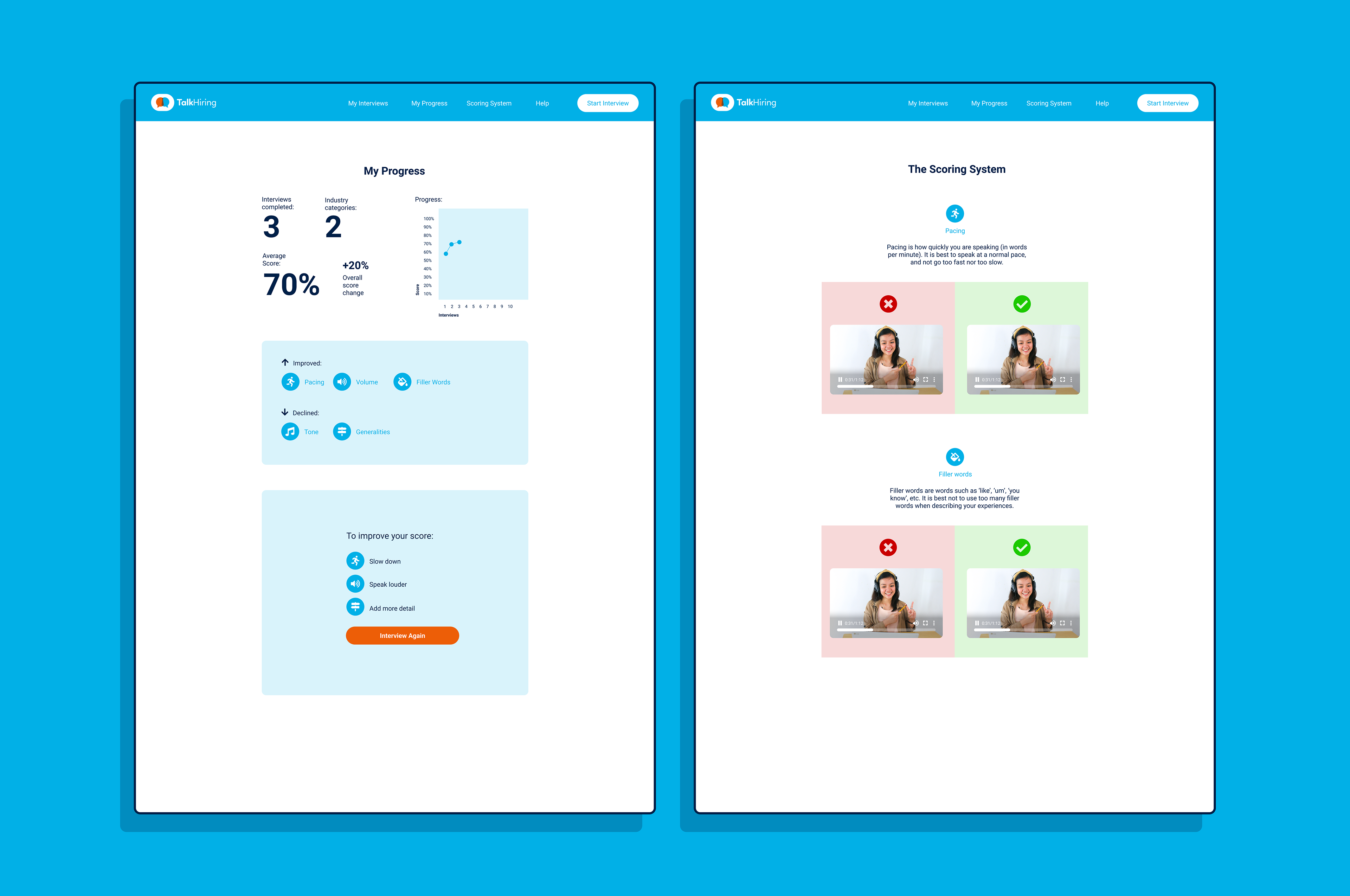
Present interview feedback directly after an interview rather than sending an access link to a user's email address. Devise a single scoring system with consistent formatting, and provide an overall interview score for more clarity. Display specific interview metrics that need to be improved, and increase the size of the CTA to take another interview.
Present interview feedback directly after an interview rather than sending an access link to a user's email address. Devise a single scoring system with consistent formatting, and provide an overall interview score for more clarity. Display specific interview metrics that need to be improved, and increase the size of the CTA to take another interview.
Explain the scoring system and metrics
Add a new scoring system page to provide a detailed explanation of each metric, as well as good and bad examples of each metric in an interview response
Add a new scoring system page to provide a detailed explanation of each metric, as well as good and bad examples of each metric in an interview response
Aggregate interview stats
Introduce an interview stats screen to track progress across all practice interviews
Introduce an interview stats screen to track progress across all practice interviews
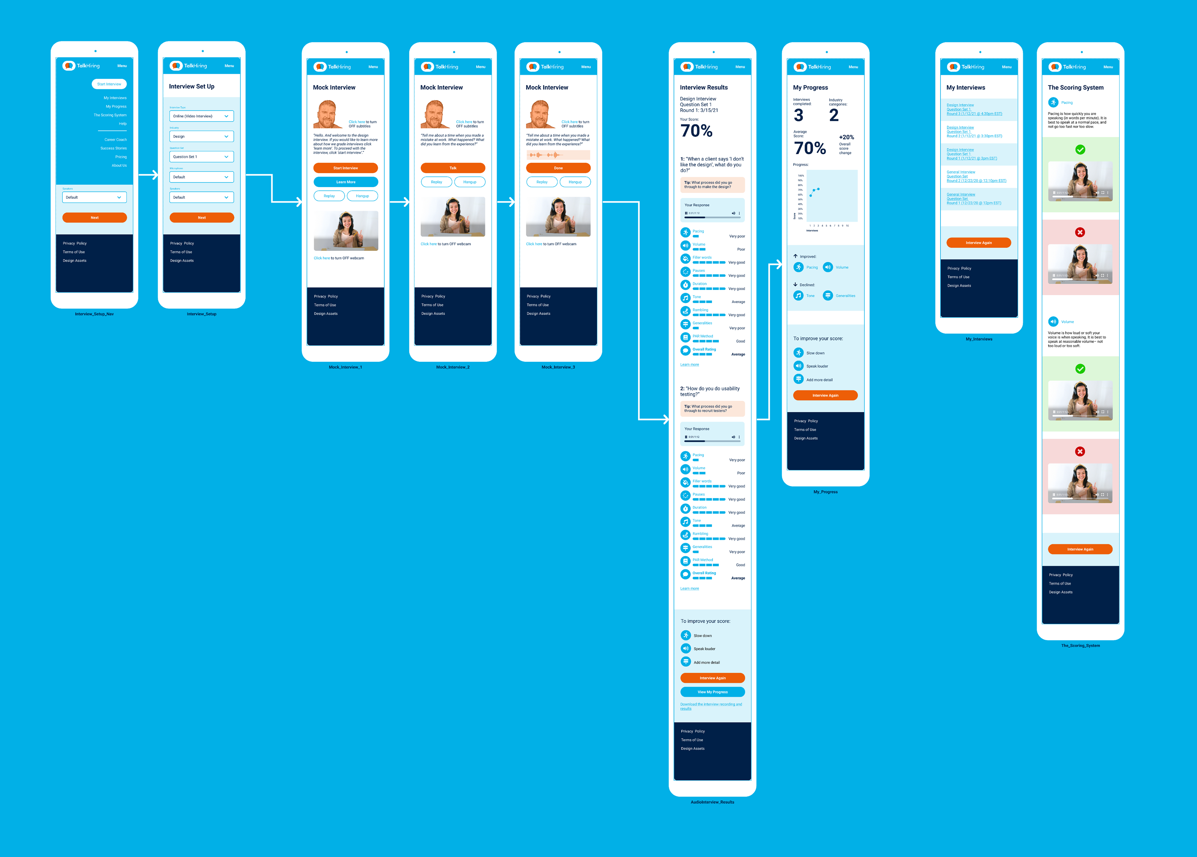
The enhanced mock interview flow for mobile
RESULTS
The designs were implemented in the app, and the updates received positive feedback from customers and users. Afterwards, I also helped the founder create and refine a pitch deck with relevant updates for Techstars demo day.
