Brand Identity Design

Project Background
ISA connects promising biomedical startups with specially-trained scientific advisory boards who can help them improve their technologies, and also secure federal grant funding for broader commercialization.
The brand design challenge was twofold: create a logo mark to illustrate the concept of assembling unique scientific advisory teams, and visually communicate ISA’s efficiency and prestige.
I created low fidelity brand prototypes, and together with the ISA team, iterated and aligned on a cohesive set of visual elements that would best represent this desired brand image.
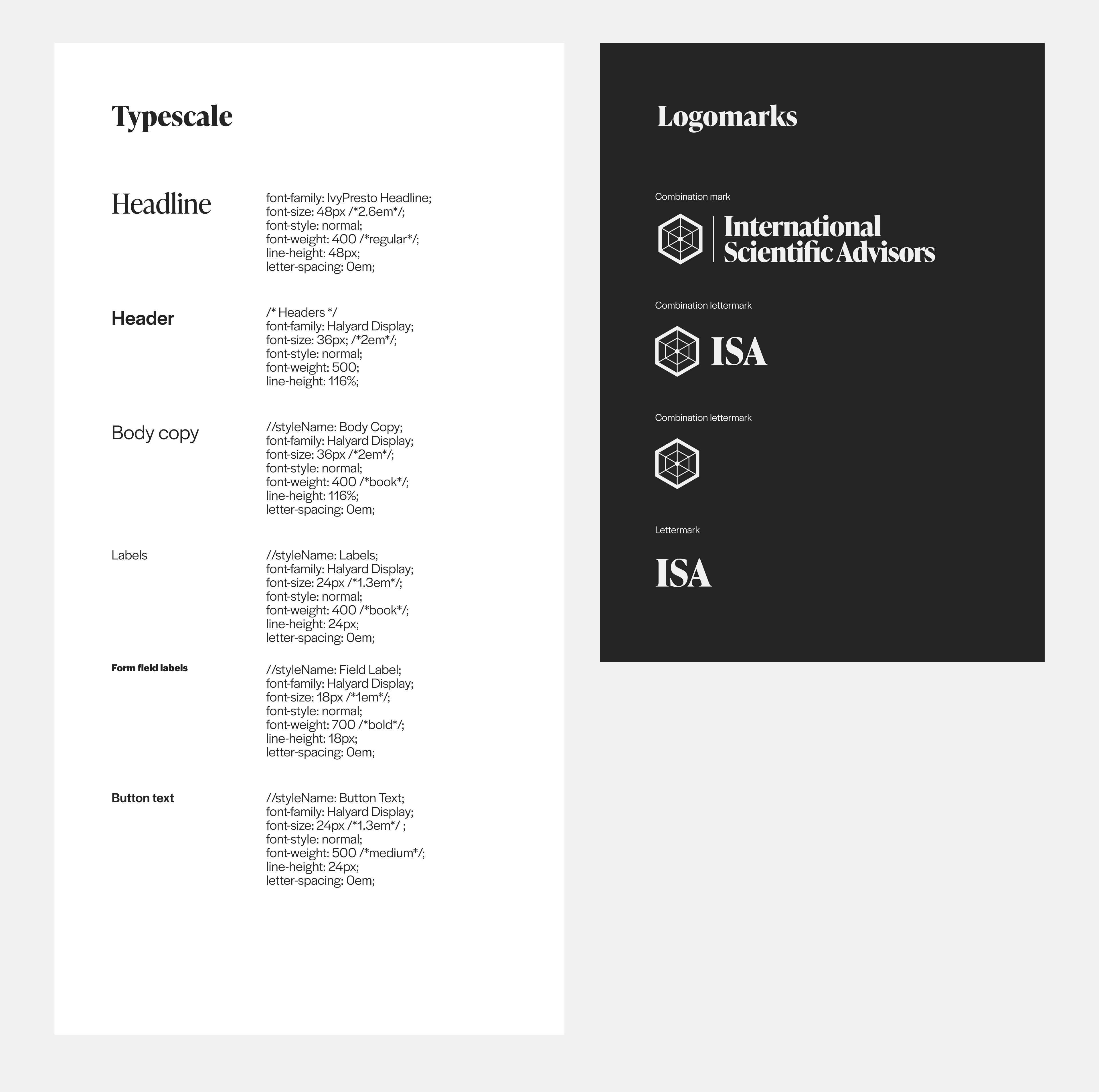
The final logo mark is inspired by the radar chart, a tool used to express multivariate data. For ISA, the mark is both aesthetically clean and technically functional. The emblem may be used as a radar chart to plot advisory team expertise– everything from areas of specialty, to grant matching experience. Its hexagonal shape can also be adapted and used for badges and achievements awarded in their scientific advisory training program.
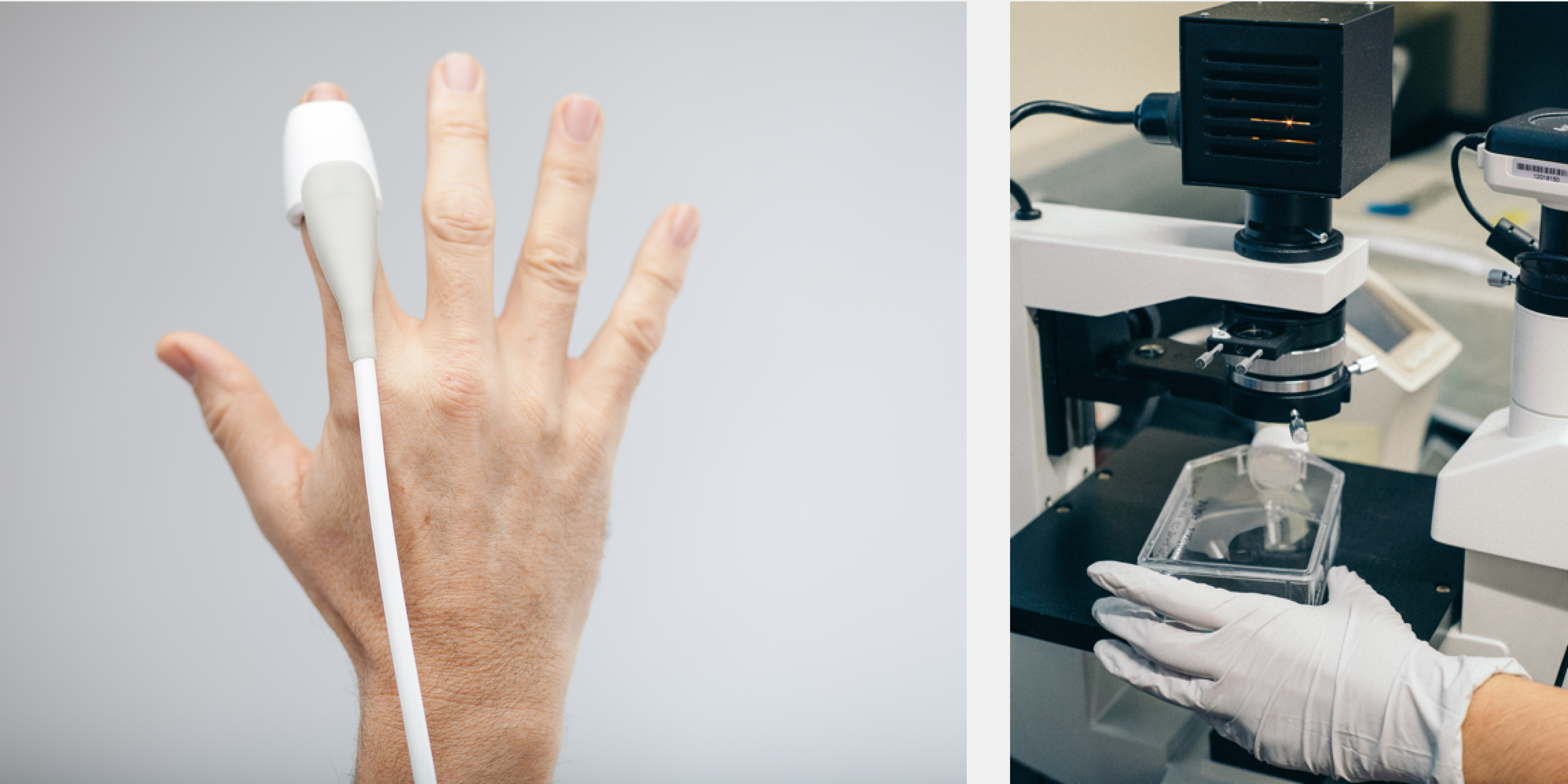
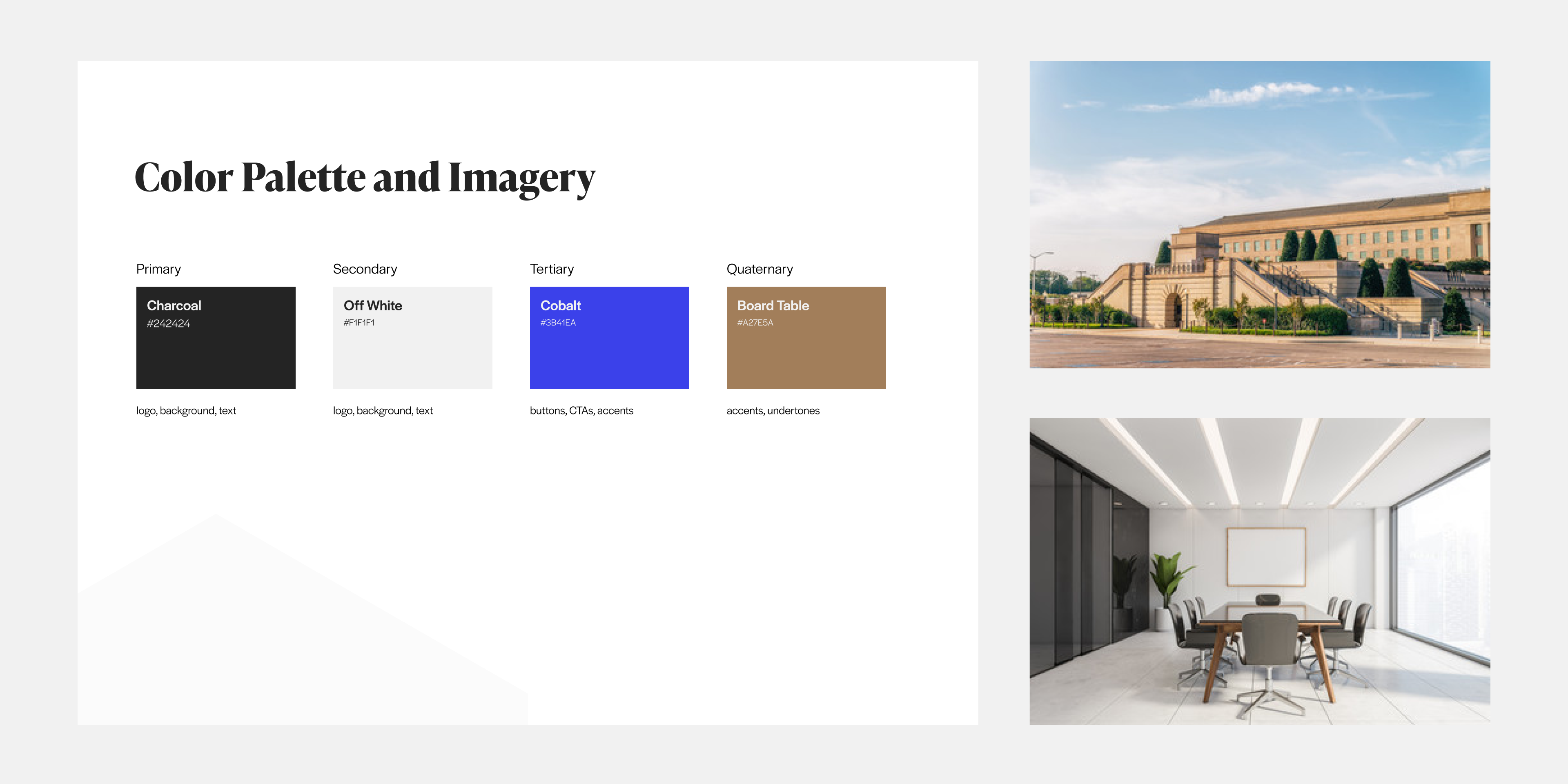
The supporting color palette and imagery are extracted from relevant physical spaces like research centers, laboratories, and board rooms, and help to invoke a sense of professionalism.